Re-imagining the art museum
When a museum is a truly living space, cross-pollination of ideas is celebrated
What makes Hammer tick
Hammer Museum is a completely free, heavily endowed art museum in Los Angeles that is focused on creating a breathing space. Every day, events are happening that have nothing to do with art in the classic sense, yet envelop the art in its own contemporaneous world. It allows for juxtaposition and serendipity in a way that is unique. They are also fearless with what artists and events they will house.

I wanted to celebrate that energy with a site that pushed art up against each other, and lived inside a continuum of events.
Responsive’s birth
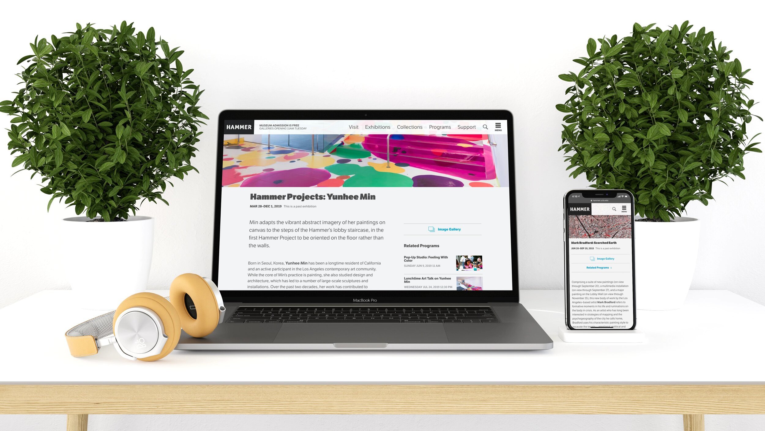
At the point in time when Hammer chose to redo their site, Flash was dead (but still driving their site) and responsive was just becoming a solution. This afforded big imagery, which was a strong suit for Hammer. It also allowed me to tuck secondary information in side columns on wide screens, but let it drop below the main content when on mobile sizes. Working this way was new at the time, and I worked with the great folks at Cast Iron Coding to implement it seamlessly.
Typography was also a big factor in responsive, with the idea of scaling size based on screen width just becoming possible. We pushed that as far as possible at the time using a slightly unusual typeface to stand out from the Proxima Nova everywhere. Using super heavy type next to hairline was also for personality reasons, and we worked hard tuning the overlay colors to make sure it was readable on loud images. We were pushing the boundaries, just as the museum was doing with art.

Deep cuts
One of the unique things about the project was the depth of curation that needed to be organized:
The museum has a bi-yearly Made in LA collection of local artists. Each artist needed a separate landing page, but they also needed to collect into a single grouping for the show.
The museum has extensive permanent collections that they have digitized for research and community outreach reasons. There needed to be a faceted search solution for the different use cases.
We needed to be able to present many different types of media in their natural form on many types of devices. Video was still a difficult medium to broadcast at the time. Most video from the archives was also digitized for on-demand consumption.
-
![]()
Made in L.A. Artists
-
![]()
Programs Landing
-
![]()
Faceted Search
-
![]()
Collections Landing
-
![]()
Image Full Screen


I ain’t perfect

Something that didn’t work out
Sometimes designers push farther than people are ready to accept. One of those situations arose when I pushed for a complete timeline of events from the beginning of the museum through present day and into the future with upcoming events. It was bold and tough to code due to the need to lazy load content on-demand in order to build the continuous nature of it. Cast Iron did a great job building it, but our client never adopted it completely. It was pushing beyond where curators were comfortable, where they just wanted a date dropdown. I was too big of a data-visualization nerd to understand that I had lost them along the way, and they quietly scrapped its use after launch.
Still kicking
After 9 years, it’s still live and going strong with minimal changes. I get great enjoyment out of making resilient products that can flex and grow without breaking the design. I feel lucky to have been able to work with Cast Iron Coding on it to see it launch and come to life.