O’Reilly Media
Senior Designer & Product Manager
2015
Rebuilding a mobile reading ecosystem for the Netflix of technical books
The Stage
Technical people want to create reference libraries for their specific expertise. There could be 1-1000 books a person wants to reference while working on a software project. How do we make our interface scalable for both extremes?
Engineers aren’t shy about their opinions of a good product. The great thing about developers is that they know what they want. The hard thing about developers is that they each want something bespoke. The business suite was often using Safari Books as well making a simple command-line interface impractical.
I was recruited to first consult, then help lead both design and product management of the mobile app for Safari Books. The existing app on both iOS and Android was a second-class citizen to the web site when I arrived. It was poorly received by the subscribers, and hovered around 3 stars in the App Store. Worse still, the app was being developed by an outsourced team in France who would be purchased by a drug company within 4 months of my start. We needed shore up the team and app, and we needed to improve the experience to the point that it could guide the web site rather than the other way around.
Starting Up
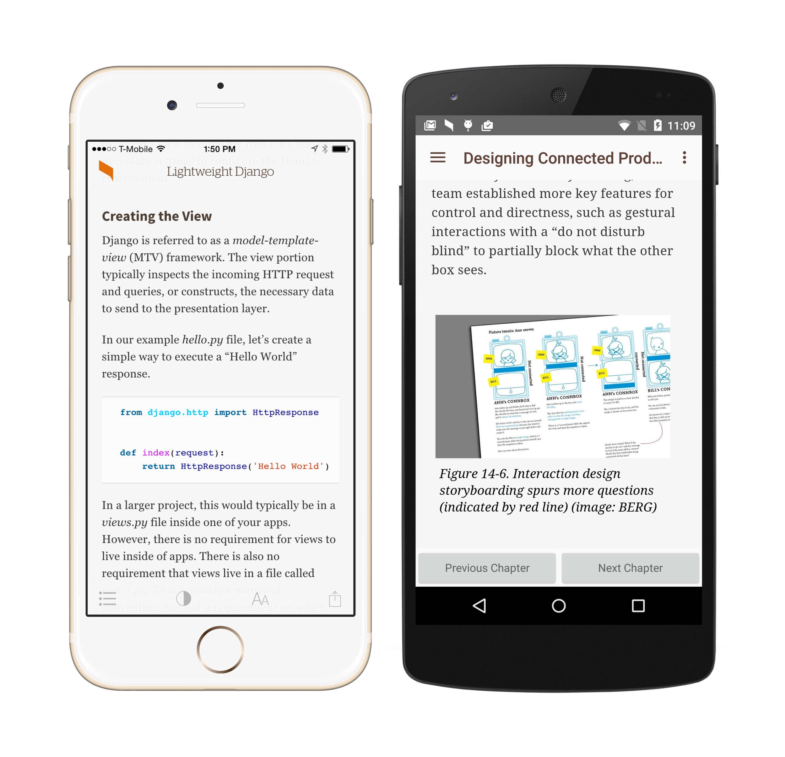
Before we could expand the feature set and make the discovery experience first-class, we needed to build a design system that could improve the out-of-reading experience and not fundamentally change the reading experience itself. The codebase for the reading experience was shared across web and app, so we had less leeway to rip out things and start from scratch.
I built a foundation that removed a great deal of stuffy design and modernize the look and feel. At the time, the app was filled with tans that were competing with the book covers. In the technical book world, people were highly attached to covers. O’Reilly’s publishing arm helped create the culture through their iconic animal illustration covers.
Early Improvements
-
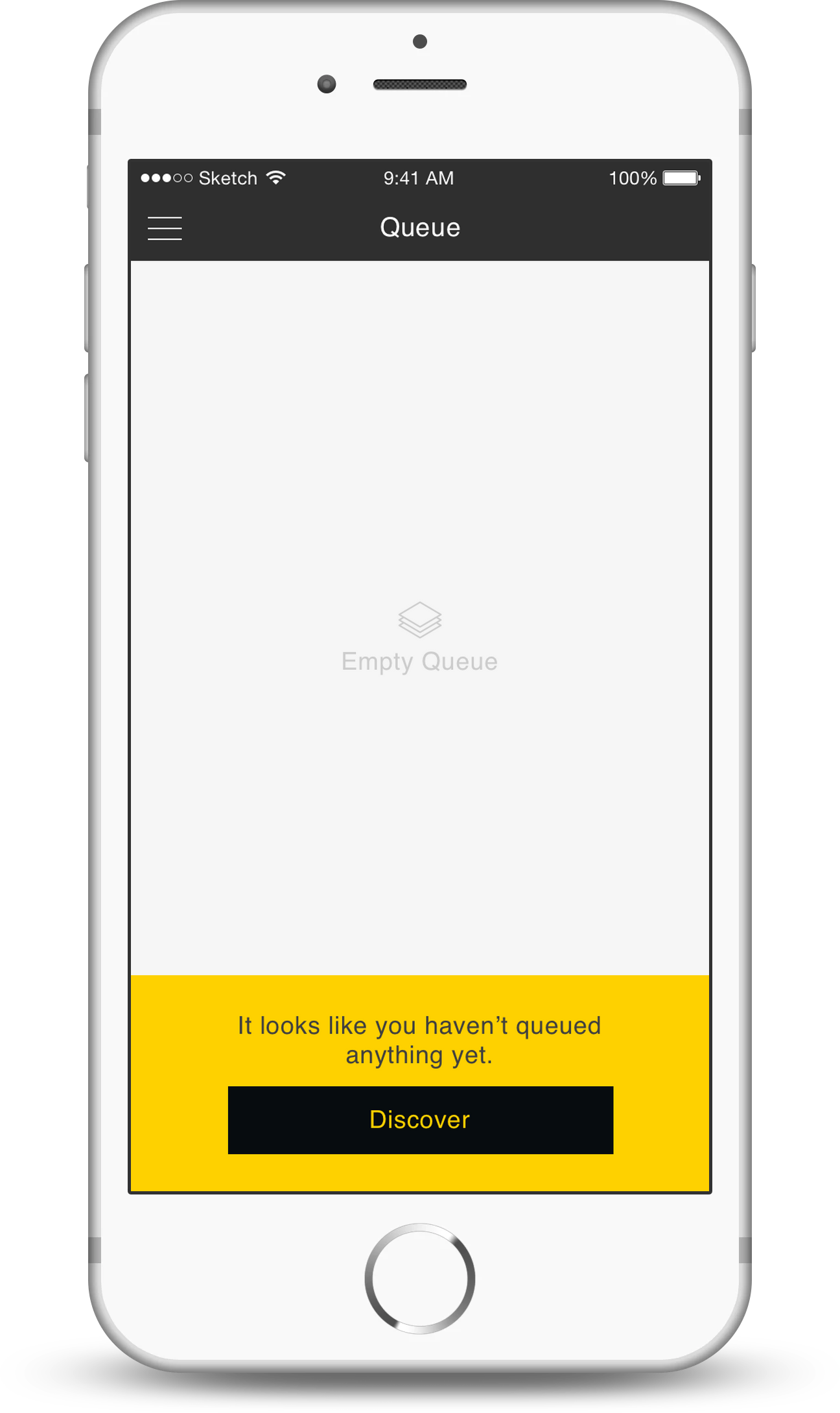
![Safari Empty Queue]()
Empty Library
-
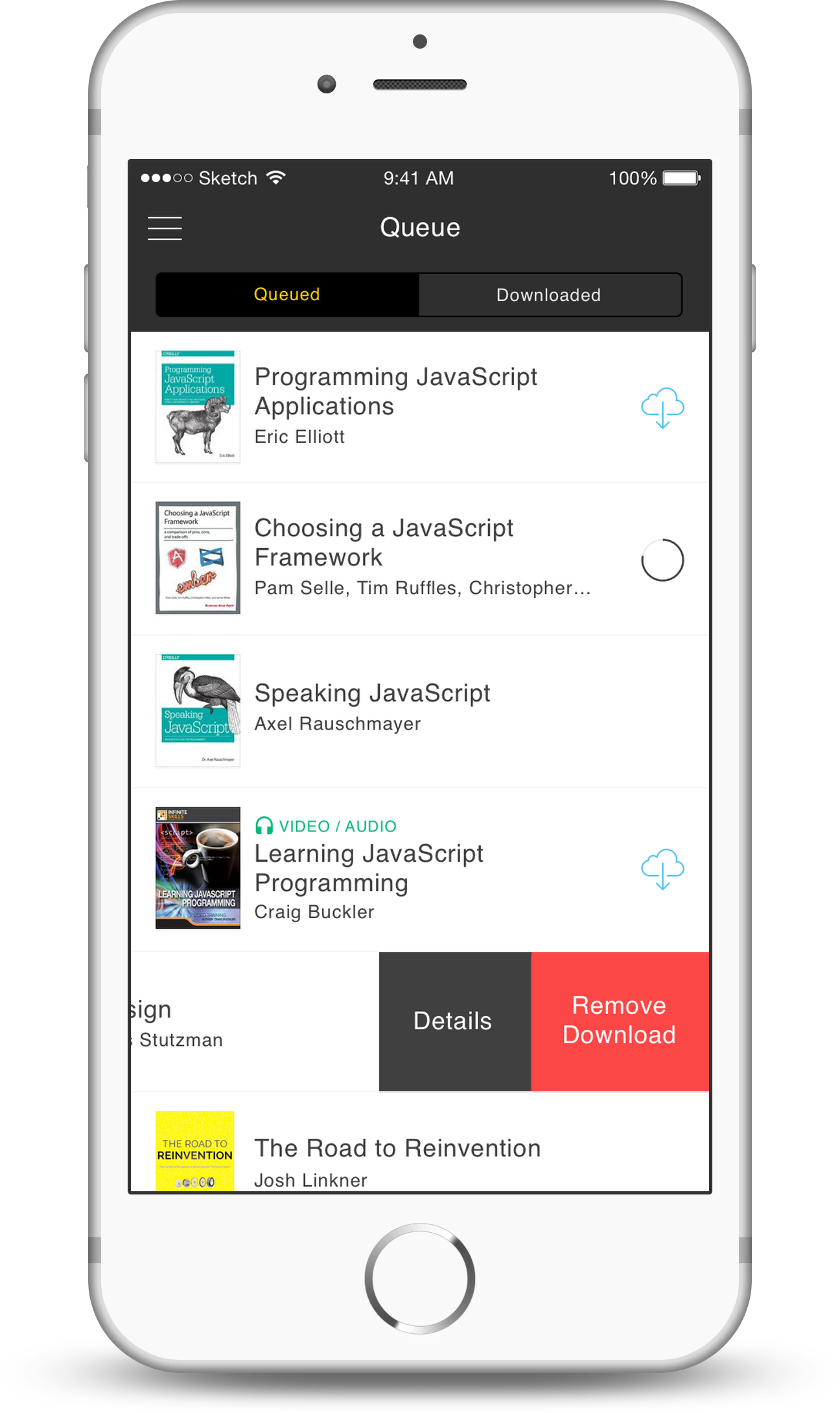
![Safari Queue]()
Main Screen
-
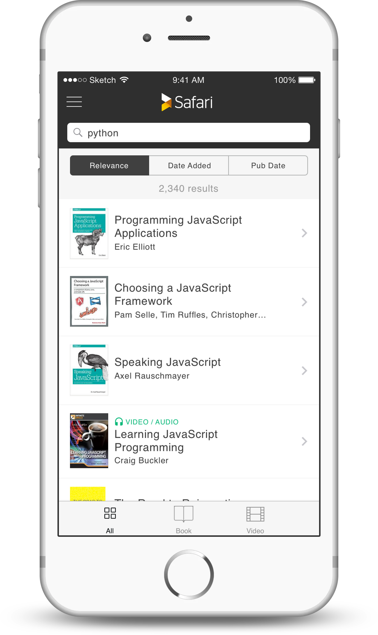
![Safari Search Screen]()
Search Results
-
![Safari Detail Screen]()
Book Detail

User Feedback
A unique opportunity to engage with our users in a much more personal way appeared in the form of a service (inappropriately) named Smooch. The service allowed the product managers and designers to respond to product complaints as asynchronous chat messages. The user would chat within the app itself, while the staff saw them as individual Slack channels. Users by-and-large come into support scenarios expecting to have to be aggressive to get attention. We became adept at disarming them by being upbeat and engaging with their problems. The opportunity to discuss product issues with the actual product manager creates a strong feedback loop where we could solve the big problems and clearly explain the challenges we weren’t going to solve.
With this wealth of information, we began chipping away at the features that were most desired. We were initially catching up to the web experience, then we started trailblazing new features that the web team implemented.

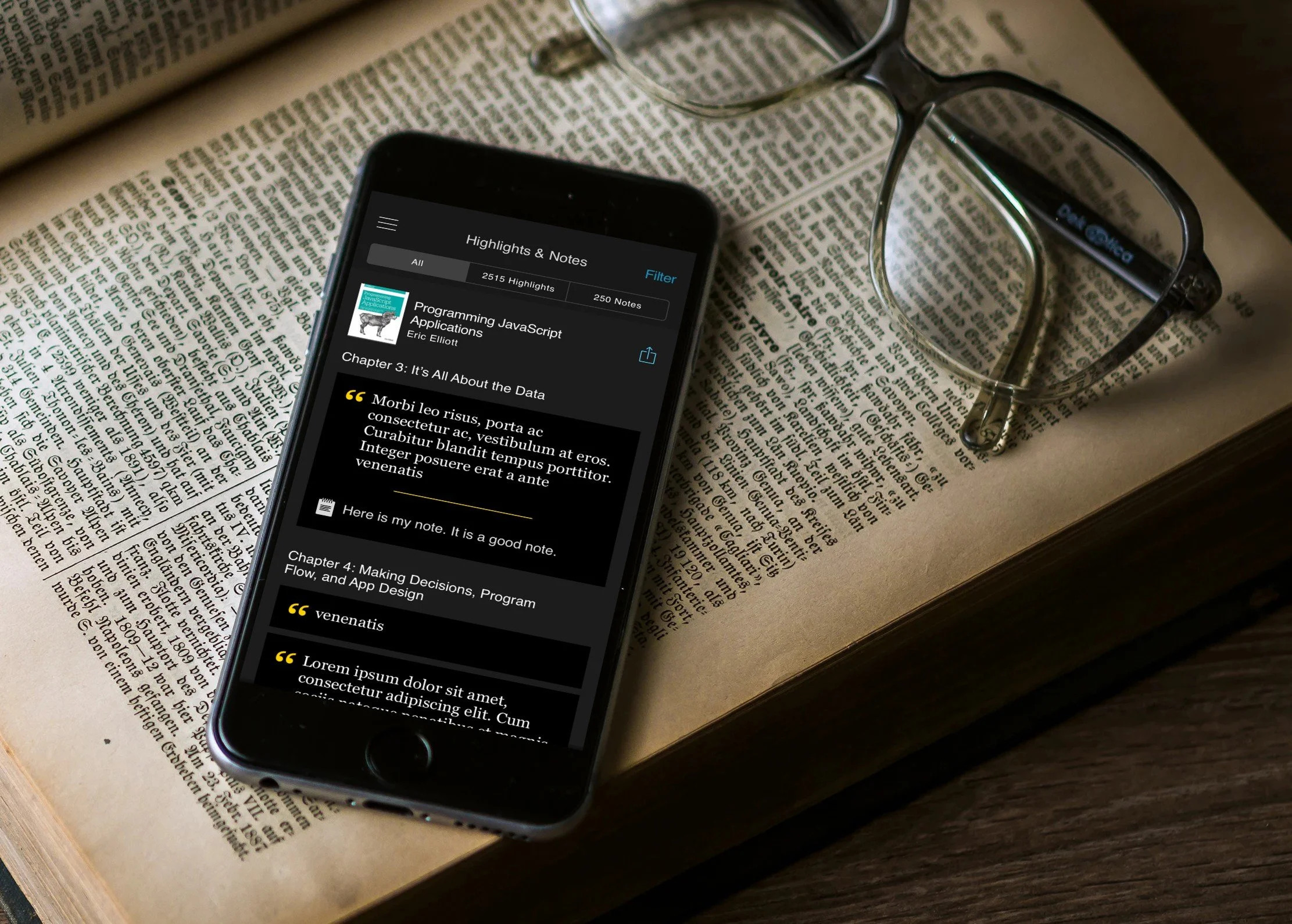
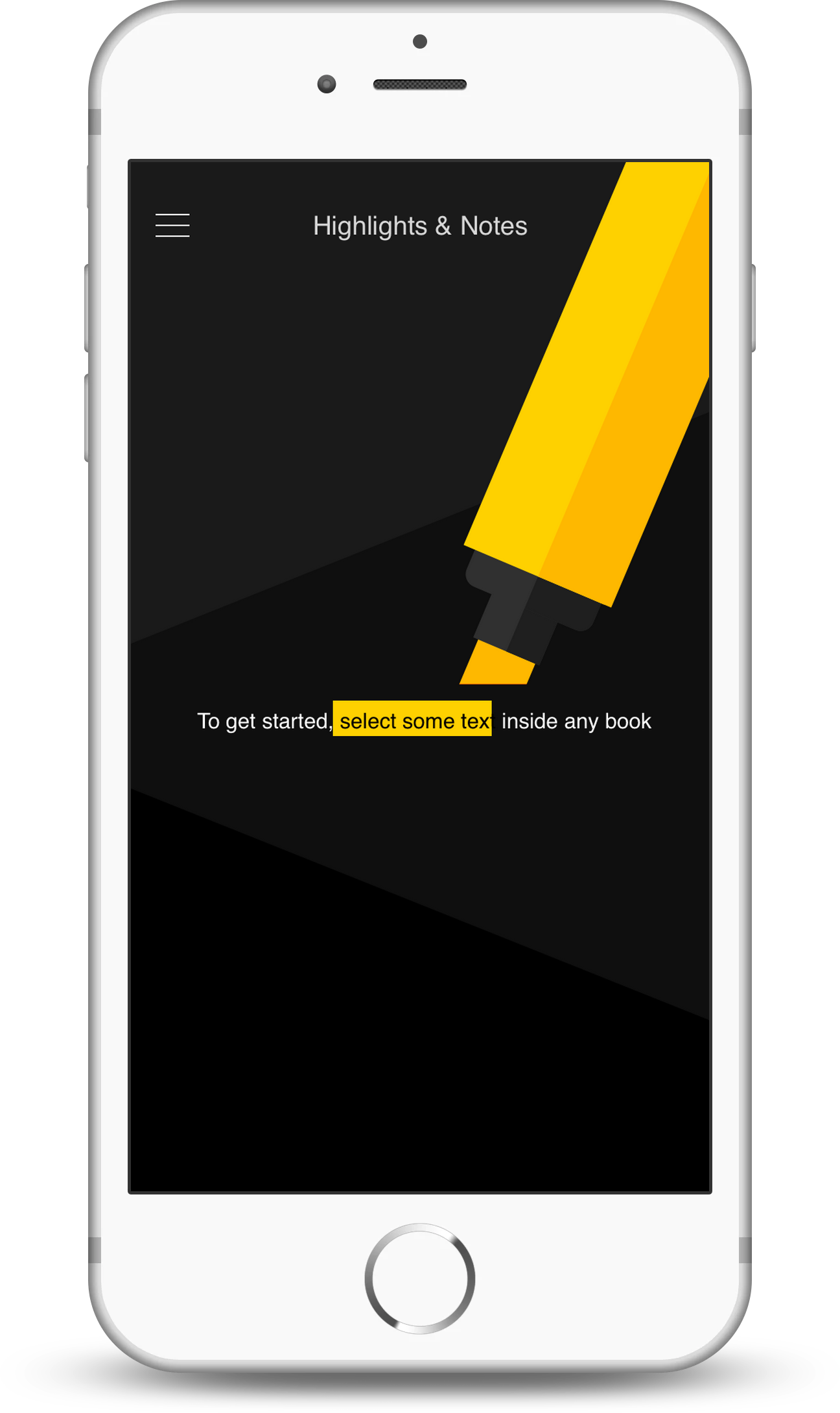
Highlighting and Annotations
Dark Reading Mode

Video Capabilities
AppleTV App
Keyboard Shortcuts
Search Inside Books
Offline Mode
Improved Discovery
Tagging and Sorting
Team-building
While the design was coming together, we also needed to completely rehire our mobile engineering team. I was part of the leadership team at this point, and myself and another Product Manager handled hiring 6 recruits. Creating a team that was harmonious and balanced was a new challenge for me, and the team got up to speed and performant in 3 months. Our users never felt the upheaval on their end.
The Internal Coup
Being able to see deeper into the organization was both liberating and difficult. The company was in the middle of a slow changeover from being partly owned by two competing companies to being wholly owned by O’Reilly Media. Many of the leaders of the Safari Books division left or were ousted. The new leadership was much more commerce-focused and pushed for major cultural shifts. I worked hard to shelter the mobile team from the strife as much as possible while advocating for a balance of old and new.
In this period, my superior Creative Director left, and my superior’s superior offered me the Creative Director job. I declined based on the volatility in the org. The next week, I was boss-less and trying to decide if I wanted to be a part of the organization any more.
I ended up burying into the design work and solving a few more major issues and started looking for other work. Luckily, Stop, Breathe & Think was reconstituting as a startup, and wanted me to join. I left the team with about a year’s worth of features to implement, knowing that inevitably strategy would change before they got to them. I was proud of the work we had been able to accomplish and the team we had built in such a short time.
Design Processes
Whiteboarding
Design Systems
Information Architecture
User-engaged Design
Engineering Support
Brand Design
Iterative Design
Search Design
User Research
Team Management
Product Management Processes
Team Hiring
Ways-of-working Design
Customer Experience
Product Marketing
User Interviews
Roadmapping
Feature Prioritization
Leadership Committee
Release Management
Cross-engineering Coordination